Inclusive

Users Don't Hate Change. They Hate Our Design Choices.

For years, we studied teams rolling out new designs, to see if we could mitigate negative reaction to new releases and design changes. We studied hundreds of product and service rollouts. We watched and learned from the reactions of thousands of users.

When we dug into what those users’ reactions [were], patterns emerged. The users told us the changes inconvenienced them. They had no idea the change was coming and suddenly it was in their face. Users were upset because they were surprised.

They also told us the old version worked fine. Even when it took a while to get comfortable, they learned it. Many users mastered difficult-to-use designs.

Everything was different when the new version arrived. What they’d mastered before didn’t help them now. The company said it was an improved design, but they couldn’t see the improvements. Why should these users learn something new that doesn’t help them? Users were upset because they couldn’t see the value.

We also saw many instances where users didn’t react negatively to changes. Often, they didn’t react at all. We saw new designs that didn’t affect the users’ behaviors and they didn’t pay attention to it.

In these cases, the changes were often not noticeable. Sometimes the changes were small and isolated. Yet, we also saw users seemingly not notice several updates with extensive changes. (In more than one instance, an entire application’s infrastructure had been rewritten without a single user noticing.)

In cases when the design changes were noticeable, the designers gave the users control to switch when they wanted. The designers showed why the change was valuable to the users. And the designers made the transition easy by taking the knowledge and experience their users already had with the product into account.
Not Your Father's Navigation Strategy: There's More Than Just the TAB Key

As a blind screen reader user, and in my career educating designers, developers, and testers on accessibility issues, I have had the opportunity to observe the techniques used by various users to understand the layout and operation of web pages and applications. I have also seen well-intentioned sighted testers believe that components or entire sites are not accessible because they were unfamiliar with the techniques of navigating the web without sight.

In this article, I will walk you through the ways a blind screen reader user can navigate a web page, gather information about its layout and organization, and use that knowledge to efficiently and rapidly navigate a site or application. I hope to convey the importance of using techniques other than the TAB key as a primary means of navigating a website and illustrate the power you provide to a screen reader user by following semantic HTML markup and the principles of the Web Content Accessibility Guidelines.

Revisiting prefers-reduced-motion, the reduced motion media query

Two years ago, I wrote about prefers-reduced-motion, a media query introduced into Safari 10.1 to help people with vestibular and seizure disorders use the web. The article provided some background about the media query, why it was needed, and how to work with it to avoid creating disability-triggering visual effects.

The article was informed by other people’s excellent work, namely Orde Saunders’ post about user queries, and Val Head’s article on web animation motion sensitivity.

We’re now four months into 2019, and it makes me happy to report that we have support for the feature in all major desktop browsers! Safari was first, with Firefox being a close second. Chrome was a little late to the party, but introduced it as of version 74.

[…]

Reduce isn’t necessarily remove

We may not need to throw the baby out with the bathwater when it comes to using animation. Remember, it’s prefers-reduced-motion, not prefers-no-motion.

[…]

If the meaning of a component is diminished by removing its animation altogether, we could slow down and simplify the component’s animation to the point where the concept can be communicated without potentially being an accessibility trigger.

Reader Mode: The Button to Beat

A reminder of why reader modes exist in browsers and to embrace them as a user’s right:

Good design isn’t about forcing someone to walk a tightrope across your carefully manicured lawn. Nor is it a puzzle box casually tossed to the user, hoping they’ll unlock it to reveal a hidden treasure. Good design is about doing the hard work to accommodate the different ways people access a solution to an identified problem.

For reading articles, the core problem is turning my ignorance about an issue into understanding (the funding model for this is a whole other complicated concern). The more obstructions you throw in my way to achieve this goal, the more I am inclined to leave and get my understanding elsewhere—all I’ll remember is how poor a time I had while trying to access your content. What is the value of an ad impression if it ultimately leads to that user never returning?

Allow Ctrl- and Shift-clicking links in event handlers

I just recently updated a bunch of my click handlers to not act when the Ctrl or Shift keys are pressed during the click, so that links can be opened in new tabs or windows by the user if so wanted:

Code language: JavaScript

// Don't do anything and defer to the default action if a modifier key
// was pressed during the click (to open the link in a new tab, window,
// etc.) - note that this is a truthy check rather than a strict check
// for the existence of and boolean true value of the various event
// properties:
// * https://ambientimpact.com/web/snippets/conditional-statements-and-truthy-values-robust-client-side-javascript
// * https://developer.mozilla.org/en-US/docs/Web/API/MouseEvent/ctrlKey
// * https://developer.mozilla.org/en-US/docs/Web/API/MouseEvent/shiftKey
if (event.ctrlKey || event.shiftKey) {
  return;
}

Container-Adapting Tabs With "More" Button

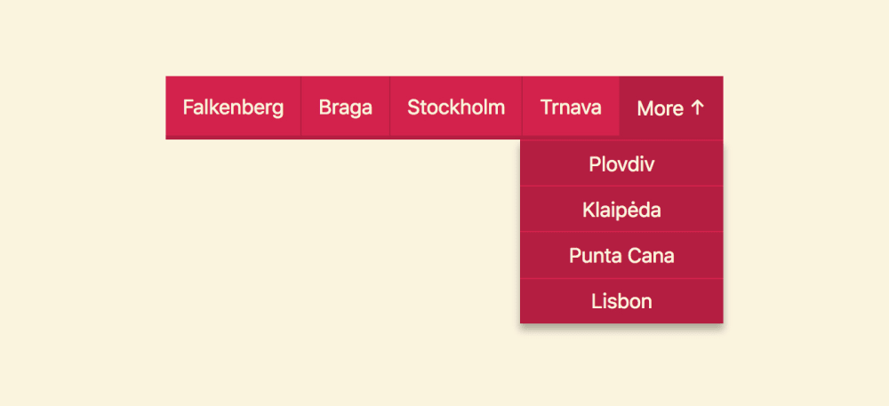
This looks like an excellent, accessible starting point for the priority navigation pattern:

Or the priority navigation pattern, or progressively collapsing navigation menu. We can name it in at least three ways.

There are multiple UX solutions for tabs and menus and each of them have their own advantages over another, you just need to pick the best for the case you are trying to solve. At design and development agency Kollegorna we were debating on the most appropriate UX technique for tabs for our client’s website…

We agreed it should be a one-liner because the amount of tab items is unknown and narrowed our options down to two: horizontal scroll and adaptive with “more” button. Firstly, the problem with the former one is that horizontal scroll as a feature is not always visually obvious for users (especially for narrow elements like tabs) whereas what else can be more obvious than a button (“more”), right? Secondly, scrolling horizontally using a mouse-controlled device isn’t a very comfortable thing to do, so we might need to make our UI more complex with additional arrow buttons. All considered, we ended up choosing the later option[.]

What do programmers actually do?

This excellent video by Physics Girl breaks down some of the misconceptions about what we programmers actually do and why we do what we do, with a focus on women and femme people in the field. I could relate especially to the discussion about it being very much about enjoying problem solving.

Global Accessibility Awareness Day

May 17th is Global Accessibility Awareness Day. See the source link for more. The participate page is a great list of things to test for and be aware of.

The target audience of GAAD is the design, development, usability, and related communities who build, shape, fund and influence technology and its use. While people may be interested in the topic of making technology accessible and usable by persons with disabilities, the reality is that they often do not know how or where to start. Awareness comes first.